4. Zone Composition
 Where's the Wall? D'oh!
Got comp? Got framing? Got
an image that speaks to you? These are questions that should
be running through your brain/eye/critic (in your own words,
of course) every moment you apply face to viewfinder.
It's aMAZing to see how many
images are gathered by perfectly fine equipment in the hands
of photographers who aren't thinking about composition. It's
as if the questions running through their minds were, "Is
it in focus?" "Is her nose in the middle of the shot?"
"I wonder what's for lunch?"
Yep, the photographer is often
out to lunch all right. Results range from gagg to spew, spiked
by the occasional accidental gem. Picking up a camera and shooting
images of friends and family, interesting vista or monument,
breathtaking scene or vital documented event, should be done
with more understanding than aiming a laser pointer.
Of course, this invective
isn't aimed at you or me. It's for that person reading over your
shoulder.
The solution to this is about
as difficult as remembering what a verb is. In other words, it's
a plague of bland caused by vast empty spaces rather than by
denying some radical belief.
People don't shoot bad pictures
because they're rebelling against some irritating teaching they've
heard or to get back at their abusive parents or insulting teachers;
they shoot bad pictures because they haven't gotten The Word
on how to avoid them.
Optics
 Not everyone is concentrated on Visual Thinking as
their main focus in life. I know a guy with 20/20 vision that
is a total Verbal Thinker and someone with 20/500 vision (exceptionally
poor) who is a Major Graphic Designer at the highest level.
Not everyone is concentrated on Visual Thinking as
their main focus in life. I know a guy with 20/20 vision that
is a total Verbal Thinker and someone with 20/500 vision (exceptionally
poor) who is a Major Graphic Designer at the highest level.
So it isn't a sight thing. It's in the
sense of That Which Looks Good that one may discover their
personal zone of visual achievement.
What looks good to you? You might say something
like, "That depends..." and everyone would have a different
answer from that point on. But the general response of human
preference, cutting across all cultures and reaching thousands
of years into the past is this: "What looks good to me is
something that pulls my thoughts into a new appreciation."
If you can let that attitude wash over you, then with a few extra
phrases of support, you can take better feeling pictures.
What will they contain?
A story of some sort. A construction of
elements that steers the viewer into a logical or emotional understanding
that communicates the existence of something(s), its relationship
to something else and/or its action(s) within that context. Sounds
complicated. But a story can be real small.
For instance here's a small story: It
Is. That's it. Just two words. The It can be anything and
the Is is validation of its unambiguous existence. CSI
photographers tell this story with their pictures all the time.
A basic paparazzi flash from the camera gets rid of all that
irritating lighting and shows the true colors of the subject
in question with a minimum of distractions.

What's the story here?
The Dime? No, more than that. The Big, Honking Macro
Shot of a Dime?
This is a Dime Seen Very Close? Even against a plain white
background the story grows:
Here's a Worn Dime on Paper That Has Texture. Intuitively
we scan the image for visual sub-plots. Scratches, lighting,
metal patina all contribute to the visual story. Hey, nobody
said these stories had to be big.
 Of course, it's almost impossible to isolate a visual
story down to just two words since a subject is generally in
some sort of environment, even if it's the simplest of all.
Of course, it's almost impossible to isolate a visual
story down to just two words since a subject is generally in
some sort of environment, even if it's the simplest of all.
Variations of It Is include: This
Is It, This Is What It Looks Like, Here Tiz,
It On White, It Floating In Black, and so on. By
the time the story becomes A Flower Emotionally Posed Against
A Sea Of Out Of Focus Vegetation the communication of the
story contains quite a few visual sub-plots.
The "It is" story is perennial
and timeless. From cave drawings to photos of Aunt Mini in front
of the Eiffel Tower, that same base level image will be taken
about 700,000,000 times today alone by human kind. At least 699,999,000
of them could have been improved with a little whisper in the
ear of the photographer.
 Do you hear these whispered questions? "Framing?
Composition?" Of course, in order to know how to respond
to these whispers, the photographer has to know what each term
means and how to apply it.
Do you hear these whispered questions? "Framing?
Composition?" Of course, in order to know how to respond
to these whispers, the photographer has to know what each term
means and how to apply it.
Framing
Putting a line around the subject. Cropping
the world. Holding up your hands with thumbs and index fingers
suggesting a frame. Deciding what's out of the picture. Framing
must be done from one spot. The spot where the lens is at this
moment. You can't frame from over there if the camera is over
here.
Composing
 Arranging things, especially within the frame. Putting
stuff here or there. Finding the place in space (and often time)
from where an image may be framed. You can compose by moving
the camera over there if the framing over here isn't as nice
as you want.
Arranging things, especially within the frame. Putting
stuff here or there. Finding the place in space (and often time)
from where an image may be framed. You can compose by moving
the camera over there if the framing over here isn't as nice
as you want.
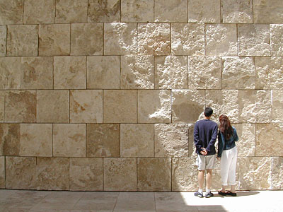
Where do you put things in a composition?
The ergonomic, human-desired place to put things is where our
visually evolved brains appreciate seeing them. One classic formula
for this is defined by the Rule Of Thirds, and while it helps
you more than hinders you, it is far from the whole story.
Both images just above are Rule Of Thirds
compliant. Important visual targets tend to hover around the
tic-tac-toe intersections one might mentally lay over each image,
but other things are going on that complete the pictures.
Each image had to be composed by moving
subject matter and the camera to a place from which the subject
matter could be seen and understood. Then each was framed to
include the important and purposely exclude the unimportant.
Each could be easily further improved in all departments, but
as is, they each tell a story. Guess which is Ebonies and
Ivories and I Want This. Clearly one is a joke and
the other is a variation of It Is.
Adding Interest
One image adds interest from its inherent
theme and variation of common cuppa coffee elements. In particular
the circles of contrasting fluids in contrasting colors of containers
is subtilely informative. A white creamer or a square one would
be a different story.
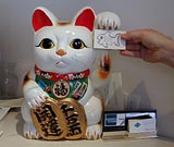
The sushi bar's cat figure (an iconic presence
in all sushi bars) augmented by a human hand and drawing of a
fish takes the shot completely out of a candid capture of a found
situation and into a purposely made joke. The story here might
be said in words as OK Kitty, Here's Your Fish--And It's Just
As Artificial As You Are. Presumably you get the joke without
the caption.
Of the two shots here, the cat statue is
the most composed, since it took preparation, POV, human intervention
and lighting to carry it off. With more preparation the background
might have become better controlled and extraneous elements removed,
but it's not bad for one minute's work.
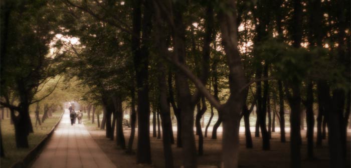 It's possible to compose some elements after the image
has been gathered. Here's a shot that was composed and framed
at the moment of making the original image, then run through
additional processes of cropping and strongly adding digital
darkroom techniques to produce an emotional result.
It's possible to compose some elements after the image
has been gathered. Here's a shot that was composed and framed
at the moment of making the original image, then run through
additional processes of cropping and strongly adding digital
darkroom techniques to produce an emotional result.
It strongly pushes the Rule Of Thirds into
exaggerated interpretation, but still adheres to that convention
even while forcing it into new territory. You don't need to know
that it was take in Beijing's Tian Tan Park to appreciate it,
but now that you know, its story expands.
Inner Voice
As images like these come together, it's
because the photographer had a different dialog going on internally.
I happen to know that he was not in the slightest interested
in what's for lunch (the Sushi Bar Cat was taken on the way out,
for instance) and that merely throwing a frame around the subject
matter was only part of the mental conversation.
An inner mantra was at work. Framing and
Composition were mentioned, along with questions like How Far
Can I Push This? and What Can I Cut OUT Of This Shot?
Here are some good questions to have on
the tip of your cornea as you pull an image together:
- Where's the frame?
- What's being composed?
- What can be eliminated? What
can be cut into?
- Is it urging me to interpret
it symmetrically?
- Can I get closer? Farther
away?
- How are those thirds doing?
- Is some other fundamental
geometry pulling this together?
- Should I move to a different
place?
- What's the right exact moment
for this?
- Does this make sense to others,
too?
- Is there a story here (a
caption will do)?
Now go out and shoot some images while
these questions are fresh in your mind and let me know if running
these phrases around in your head has helped you.

 For your Canon Digital Rebel- DSLR: Canon Digital Rebel EOS 300D eBook is already on the shelf. DSLR: Canon Digital Rebel XT is next. Then DSLR: Canon 20D follows. These are great cameras with a great deal inside them, so we put a great deal of information into their eBooks. You'll find things here that nobody else ever told you about and not even Canon knew or could discuss.