2. Dynamic
Range
 How Black is Black?
Dynamic range is the measure
of an imaging system's brightest subject to darkest subject.
It answers the question, "How much tonality can I capture
in a single exposure?" and the answer is far from simple.
Digital photography, as it
is interpreted by JPEG images, attempts to hang on to a useful
dynamic range right up to the point of whitest white. One can
see this in an editing program such as Photoshop as a brightness
of 100% or and RGB value of 255, 255, 255.
Everything under that point
is represented by a smaller percentage or numerical point in
RGB space.
In ergonomic terms this means
more to us humans when it is represented in percent, so this
article will discuss it that way.
At 100% a pure white result
prevents there being any brighter detail. The ceiling has been
banged into. Your print paper will accumulate no ink; your computer
monitor won't push more electrons or your flat screen LCD elements
will be completely illuminated.
Presumably, at 0% the image
will report nothing but totally black pixels, allowing no more
detail to be derived from the exposure. Prints at this point
will have piled on so much ink that nothing darker could be added
to the paper from the printer.
In the photographic world
of film, digital images are like transparencies --slide film--
in that once you've overexposed, that image is going to resist
being effectively diminished in brightness during a rescue operation.
It's whites are gone, baby, and there ain't no getting them back.
Slightly underexposed slides can be printed a bit lighter by
simply allowing more light through the enlarger. The contrast
of the reversal paper is high enough to tolerate a reasonable
amount of exposure increase. Scanning slides into the digital
realm also lets the photographer lift and shape the tonalities
of the image right up to the point at which highlights are bleached
to white.
Negative film presents and
opposite picture --pun intended-- in that very bright highlights
cause the negative to accumulate a darker image during processing.
That darker portion of the image can be teased out to reveal
more detail by pumping more light through the negative during
printing. An overexposed negative can be often "fixed"
by aggressive printing and during a transfer into the digital
realm it can be captured with a longer exposure. Later, in the
computer, the overexposed highlight realm can be stretched into
a more presentable look and the image can often be recovered
quite well.
Underexposures in a color
negative are problematic. Where shadow detail drops to near --but
not quite-- zero, pumping less light through the enlarger won't
help. It will just make the darkest part of the print grayer,
not more alive with detail. In a computer, the limit for detail
rescue has to do with how reliably the scanner has been able
to differentiate one micro-tone from another.
Scanners with a longer scale
of original digital divisions stand a better chance of pulling
out more potential detail at the extremes, but simply having
a "24-bit" versus a "48-bit" scanner doesn't
make the image automatically better. The questions here would
be, "So, what does XYZ-Corp's scanner DO with all that info?
Do they let me access the portion of the range that contains
useful numbers better than GHI-Corp's scanner?" Look to
experienced experts for a sense of that.
In the strictly digital camera
realm, people want to know how their digicam performs in terms
of dynamic range both from JPEG and RAW images. RAW images are
seductively longer in scale than JPEG shots, but just claiming
this or that performance advantage or practical advantage rapidly
deteriorates into a string of apocryphal stories.
Boundaries
The first limitation digital
photos encounter are the span of tonalities between "too
bright to see anything brighter" and "too dark to see
anything darker." In between these extremes lies our digital
image experience. But that raises a secondary issue: OUR digital
experience is our eye experience. And its experience is all tied
to our retina, viewing conditions, the media being viewed, current
dark adaptation, vision issues and even age of the viewer.
Working backwards, it probably
comes as no shock to folks to hear that younger eyes see better.
Similarly, healthy people often see better than folks with health
issues. People who are adapted to the current viewing conditions
see better than folks walking in from darker or brighter environments
and prints viewed in marginal light won't look as good as those
in ideal light.
Computer screens can --and
too often are-- be pushed to brightness levels inappropriate
for local conditions. We've all seen the family group watching
TV in the dark. And forever, TV manufacturers have been warning
that this is very stressful on the eyes. People still do it,
but these days a new factor has emerged --the Internet surfer
staring at their monitor in a dark den. And you wonder where
all those little headaches are coming from? But I digress...
Photographic prints are ink,
dye or pigment on a page of limited maximum brightness. The blackest
black to the whitest white is an easy thing to measure. Your
digital camera will serve as a light meter. Since the contrast
of an image goes up with reduced viewing surface diffusion, glossy
surfaces show the greatest contrast. Matte paper (letter paper,
matte surface photo paper) won't get as dead black as glossy
paper, so do this test with a glossy image. Print a black spot
on a white page. The image isn't thrilling but it will tell you
something.
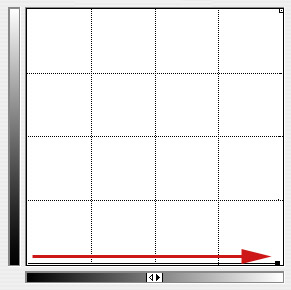
In Photoshop, make a square
of black floating above pure white. Print it out on glossy paper.
Something like this:
Shoot this print with your
camera in 1/3 stop increments from the exposure that sees the
white as bleached, pure white (your histogram will help you spot
this starting point --it's the histograph in which the white
spike is smack against, but not absorbed into, the right side
of the graph.
Back off this exposure a stop
or so, just for tolerance sake, and start shooting a string of
exposures that are brighter and brighter until the entire image
is pure white. The histogram spike of the black square will have
progressively marched across the graph until it, too, is absorbed
into the white edge of the histograph.
Now count the stops from the
frame that portrays white as 100% (RGB 255, 255, 255) to the
frame that portrayed black as 100%. One frame back from the "black
is white" frame, some tiny evidence of black should be either
visible with your eye, or technically visible by slinging around
the anchor points of the Levels or Curves controls in Photoshop.
If you have an image that still contains some tiny remnant of
the black square, you can make this detail visible by opening
Levels or Curves and dragging the black point over to the side
of the graph where the white point lives. In Curves, this means
dragging the lower left anchor all the way straight to the right
(assuming you've kept the lower left as the black/black corner
as it is, below).
This has the effect of reducing
the tonal range of the image to 4 units out of 255. (If you look
closely, you can see were the "dotted line" from the
darkened anchor angles severely up to the open anchor in the
upper right. Those extra pixels on the reference hatch are all
that's left of the line.) Any pixels that are 254 instead of
255 will now be significantly darkened to a detectable degree.
So, if this frame is the one
that exposes black ink, dye or pigment as white, and the other
exposure that shows white as 100% tonality for the first time,
the measure of stops between them is the dynamic range of ink
on the page.
What do you get? I get 4-1/3
to 5 stops. Not a huge range. Five stops (call it) is only a
ratio of 2^5, or 32:1. Can this possibly be SO!!???!!
The 32:1 Club
Welcome to the real world
in which black is really 1/32nd of white. At least as far as
paint, ink, pigment or dye can produce. If you have a blacker
black paint or a whiter white paint, I'm really interested to
hear about it. The simple phenomenon we have been living with
all these years is that our literal portrayal of paintings, posters,
house paint, photographic prints, billboards, traffic signs,
and most man-made objects are colored with a range of brightnesses
that is only 32:1.
Heresy, you say? Well, of
course this assumes that the measure is made in the exact same
light so the portrayal of subject matter in shade, low illumination
or colored light is not accounted for. And certainly there are
loads of things in our world that are whiter than white paper,
paint or substances. How about highlights, glossy reflections
of lighting? Surfaces in our visual field that are getting many
times more light than other stuff? Glints? Reflections off chrome?
That's where our eyes shine,
so to speak. The living film in your head can sort out a dynamic
range of around 30,000:1 on a good day so that piddling little
32:1 dynamic range is a piece of cake / easy as pie /walk in
the park / no brainer.
At this point I would like
to extend a warm gesture of thanks to the makers of vision. No
matter what your creed, philosophy or science, you gotta appreciate
that vision exists at all. Without it, digital photography would
be meaningless and we would all have to find other things to
perk our interest. Something strictly tactile. Basket weaving,
perhaps.
The 1000:1 Club
Digital cameras do something
your eyes do; they see the world of objects in various lighting
situations. Shade, shadow, dimmed lighting instruments and various
colors of light are all captured with your digital camera to
more or less degrees of fidelity, so it should not be surprising
to learn that digital cameras have a MUCH wider range of dynamics
than the prints they produce. The print's a physical object while
the world is a wide dynamic place full of subject matter in a
huge range of conditions.
A similar test to the one
that revealed the range of blackest black can be used to reveal
the total dynamic limits of a digital camera. The question now
becomes, "What is the range from the whitest bleached white
to the point at which all shadow detail is lost completely in
blackest black?"
The same graphic will help
us find this point, too.
As exposures drop lower and
lower, the whole image gets darker. Starting at the point that
shows the white paper as first banging its head against the white
ceiling, we shoot progressively darker shots until the f-stop
is so small and exposure time is so brief that the image of a
black square against the white paper can no longer support any
semblance of definition.
That's easy to say, but remember
that digital images have some foo factors inherent in them. A
foo factor, you may remember from Logic Class is something that
makes you say, "Aw, foo!" It's some unexpected reality
that screws up a nice, neat theory or method of testing something.
An example of a digital image foo factor is this: No two photosites
are exactly alike. Every one of those tiny light reading circuits
is inherently built to some tolerance. They're close, but some
of them are further out of spec than others.
To our eyes, this phenomenon
shows up as "noise" or "grain." The same
thing happens in film and even your eyes. (Try to observe the
random tonalities in shadows as you are dark-adapted in a barely
illuminated situation. Some of that is photon-noise caused by
statistically fewer photons reaching your retinal rod cells,
and some of it is the noise of the visual system of eye/brain.)
To make an image that for
sure has no detail, put the lens cap on the lens and shoot a
very brief exposure. This would define the absolute bottom of
the dynamic range. No matter what you did with Curves to this
sort of image, all you would get would be evenly distributed
noise.

To test a dark image for tiny
residual image capability, do the opposite of the highlight test.
Move the upper right box in Curves to the extreme left, amplifying
all pixels with values 1, 2, 3 and 4. If you can still see where
the black square was, you haven't gone to the maximum limit.
But, my gosh, look at all that noise! Is it practical to insist
that the detectable dynamic range of an imaging system includes
every speck of deep, noisy, grungy shadow detail?
Technically, yes and no. Dynamic
range in an absolute sense would include the farthest limits,
but as Leonardo Da Vinci once said, "You have to draw the
line somewhere." There's a practical limit to how black
is black to qualify as black black.
There are ways of technically
defining that point, but you must know by now that I prefer human-scale,
practical ways of measuring things. Why take some mathematician's
word for something? Is he a photographer? Does he care about
image or does he care about math?
At some point in the process
of gathering darker and darker images, you will be collecting
shots that will look totally black on your computer monitor and
print as total black. You could put black lettering over the
image and no print in the world would let you read the text.
Testing this in Photoshop is duck soup. Text will successfully
be lost in the random noise of the image--up to a point.
Tip: Use big solid letters.
You might recover something
using the Curves test, above, but don't call that an image unless
it passes the MCT test. MCT = Mom can tell. If an observer can't
make out the lettering, even after seeing what it looks like,
then that level of exposure is equal to White = Black, the definition
of the bottom of any valid tonal dynamics and the base of the
images effective dynamic range.
Here are some helpful graphics.
On which of the following
do you see text over the black? It's there on all of them, but
your monitor's exact setting will likely hide it from view for
one or more of them:


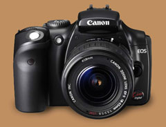
 For
your Canon Digital Rebel- DSLR: Canon Digital Rebel EOS 300D
eBook is already on the shelf. DSLR: Canon Digital Rebel XT is
next. Then DSLR: Canon 20D follows. These are great cameras with
a great deal inside them, so we put a great deal of information
into their eBooks. You'll find things here that nobody else ever
told you about and not even Canon knew or could discuss.
For
your Canon Digital Rebel- DSLR: Canon Digital Rebel EOS 300D
eBook is already on the shelf. DSLR: Canon Digital Rebel XT is
next. Then DSLR: Canon 20D follows. These are great cameras with
a great deal inside them, so we put a great deal of information
into their eBooks. You'll find things here that nobody else ever
told you about and not even Canon knew or could discuss.